Painted these a long time ago. Acrylic on foam core. – then contour cut. . . . they were hung in “Where the Wild Things Are” at the Sony Metreon event area during a halloween haunted house for kids.


Painted these a long time ago. Acrylic on foam core. – then contour cut. . . . they were hung in “Where the Wild Things Are” at the Sony Metreon event area during a halloween haunted house for kids.
watercolors to a digital piece of art.
Just a small “How I did this” – I started with a series of watercolors, done on a watercolor block. – very wet on wet technique, just using strong colors, to bleed out. Some of them, i masked a section, making a rectangular shape that cut across the paper. – After the painting dried. I coated it with a thick gum arabic solution and then used a hot blow dryer to quickly dry the surface and create cracks on the sticky gum arabic. . . . you never knew what you would get, sort of the fun part of the project. – Once the gum arabic dried, you have a nice slick surface with cracks. So now I mixed up a nice a dark indigo color, washed down the whole image, let it set for a minute or two, then I buffed it away like i was wiping a copper etching plate, careful not to lift out any pigment in the cracks, only want to remove the surface color . . . following? – what I got was the dark stain to stay in the cracks. . . . after a day of drying, I popped it off the block. – I painted about 30 different pieces. some even had an image in the center. Sold most.


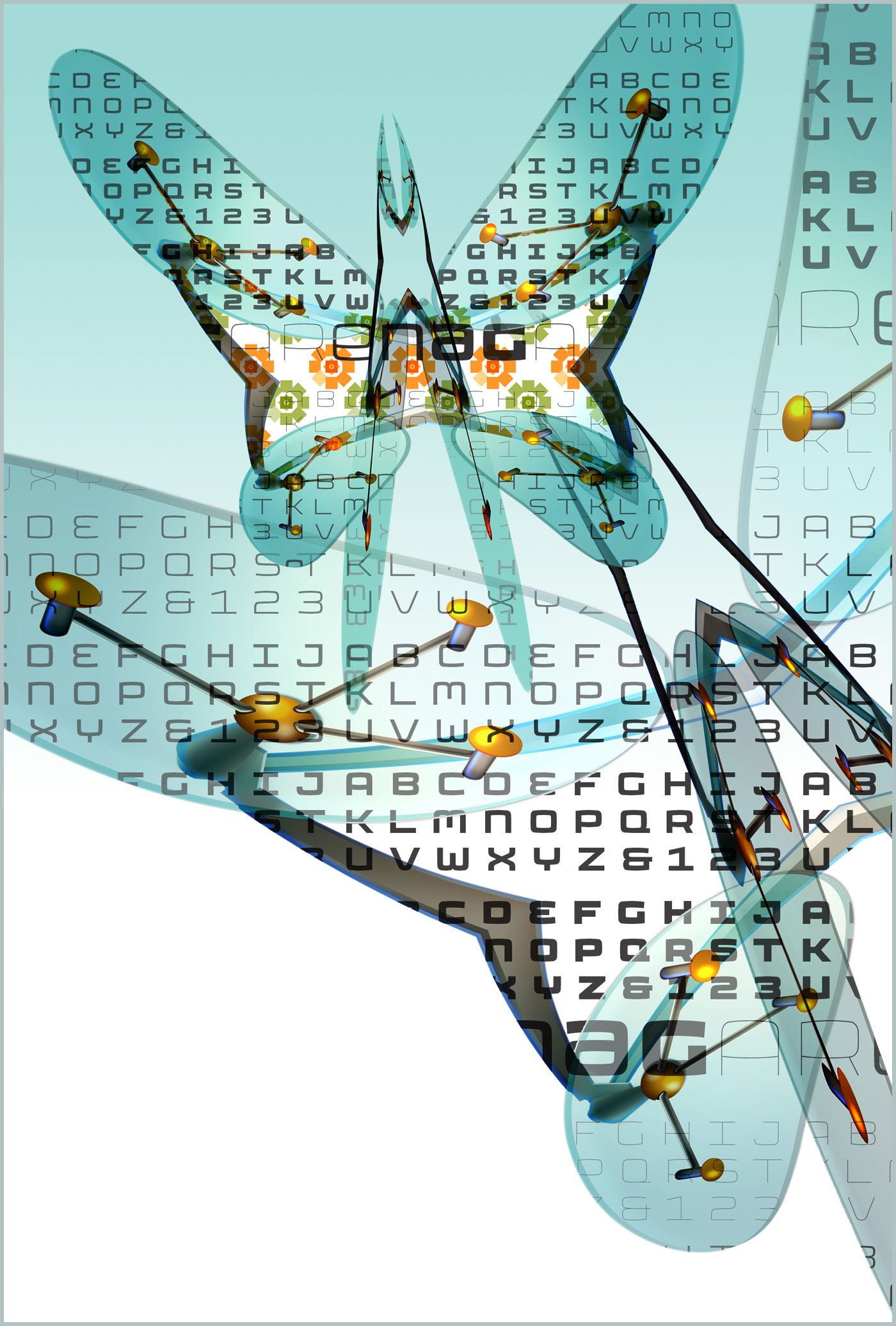
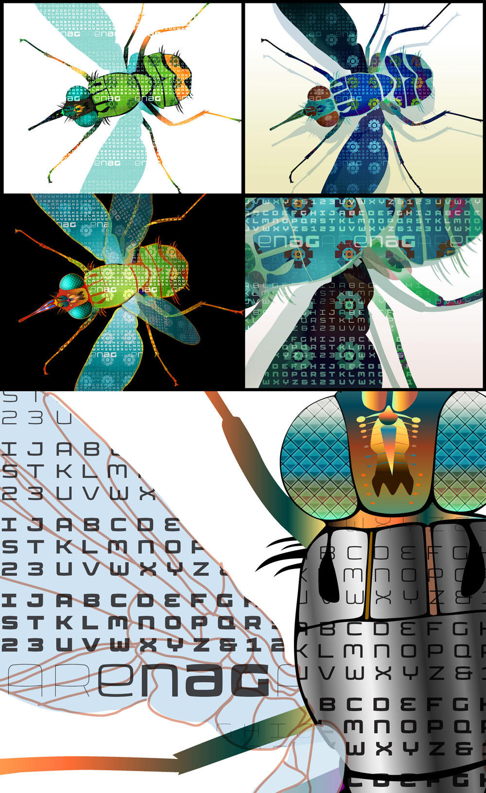
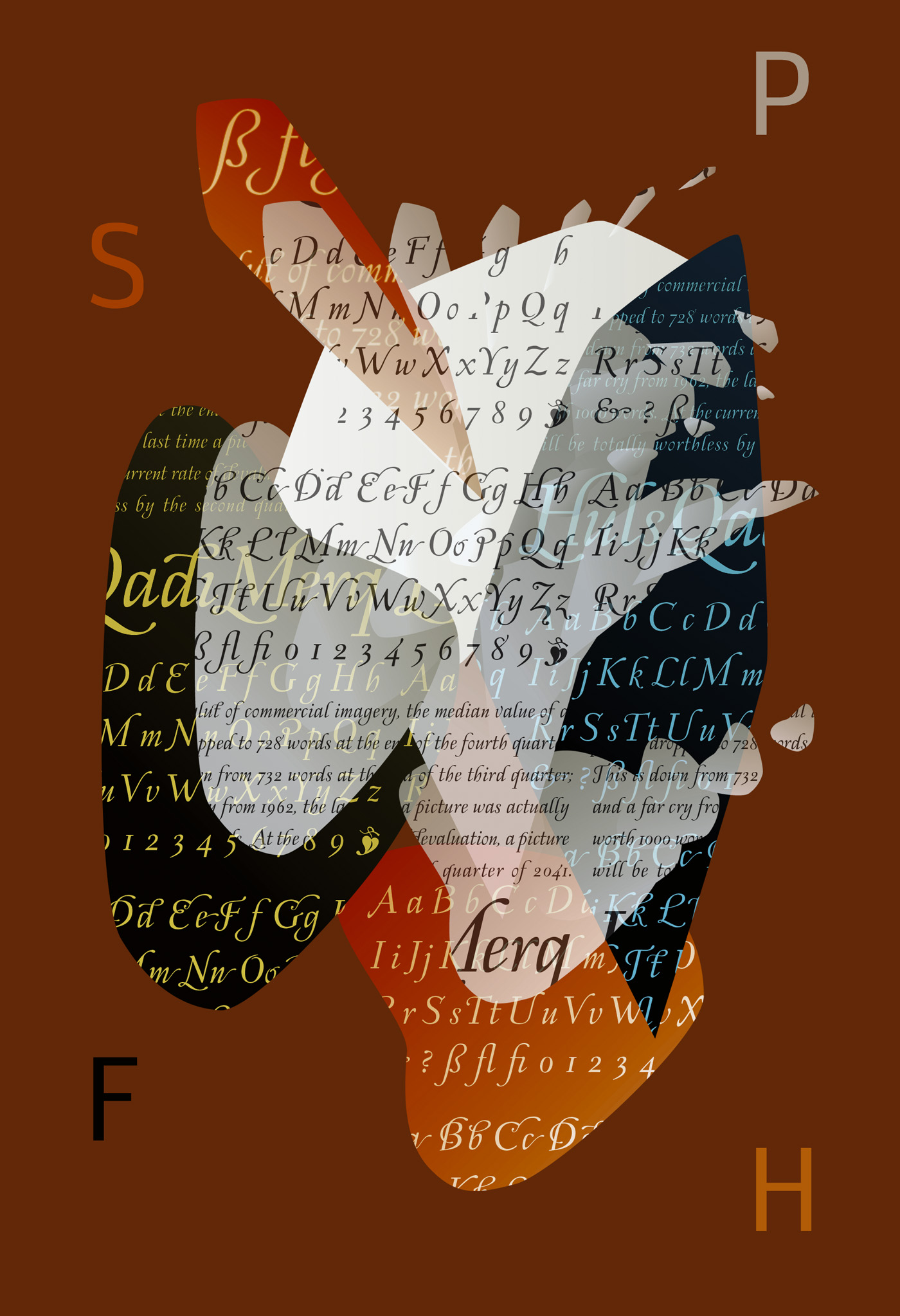
So now I have some patterns and watercolor textures. . . . I added them to a digital piece I was working on. – Put a clipping mask onto 3D objects I created in Adobe illustrator. a few actually. see below details.

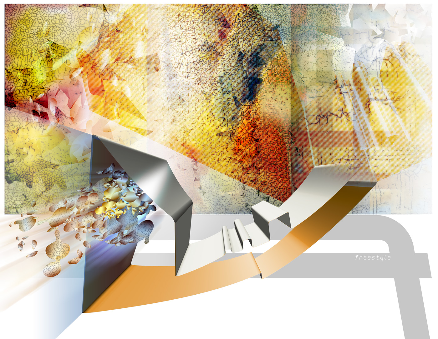
The bottom image is close to the finished version.

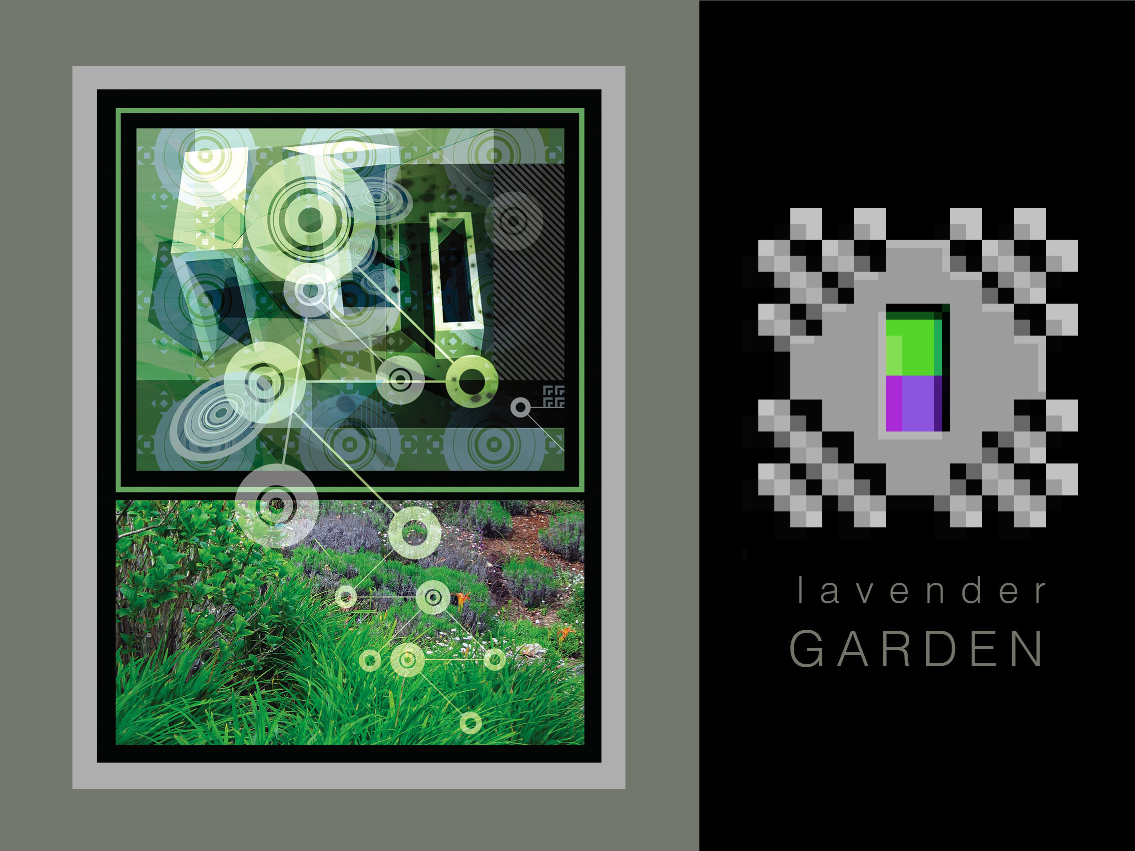
Observing a lunar eclipse, I was thinking about a design to show the phases but it turned into a little more than that. A poster and one of my favorite images.


When I had a painting and design business years ago I would draw designs out on velum or thin tracing paper and then transfer the image on to a canvas or wall – whatever surface it was painted on. I sometimes used transfer paper or rubbed graphite on the back of the drawing and then re-traced the image.
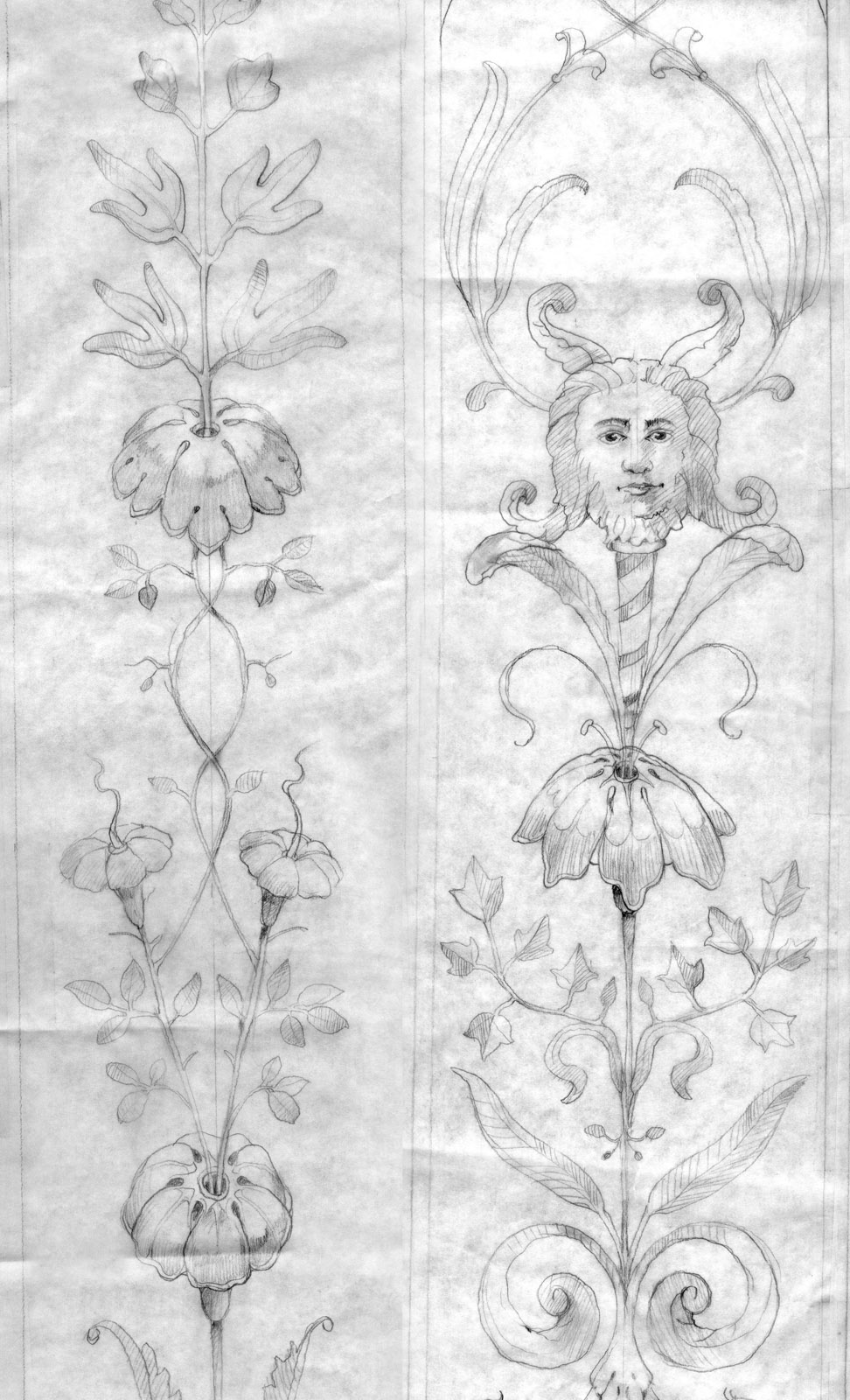
This is what other panels of the paintings looked liked in progress. The color images were scanned from older color prints. Pre-digital cameras.


I designed the white square window decals that ran along the entire length of Metreon when it was owned by Sony, on it’s 4th street side.
It covered up the original digital graphics that was once the Airtight Garage branding.
Rod Cavazos, the Principal at PSY/OPS & Adjunct Professor at CCA in San Francisco has some of the most fun fonts on the web. . . . Rod says “Hi, we’re PSY/OPS Type Foundry, a creative studio dedicated to typeface design and alphabetic innovation. We build typefaces all day long — and occasionally all night long. Our primary commissions are for tech giants and manufacturers, game developers and print publishers, as well as other foundries and design firms. We also love teaming up on more personal / experimental / academic projects. The quirkier and more challenging the better. Between client engagements, we work on fonts for our own eclectic library.”
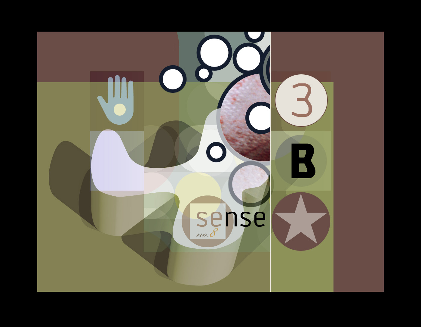
A few years ago, well maybe more than a few years ago, Rod Gave me some fonts to have fun with and I spent more than a few weeks adding them to some digital artworks I was making at the same time.


I am restoring and retouching Chopin’s Polonaise in A-flat mojor, Opus 53
written by Frédéric Chopin in 1842
Goal
Using high resolution images of the entire original work, remove non-relevant artifacts to reveal a clearer view of Chopin’s original artistic intent. Graduated cleanups will be performed with a permanent record of each evolution. The final result will be converted to Scalable Vector Graphics format preserving the score’s details at any scale. All images will be in the public domain.
Why
Starting with the first published edition editors have made adjustments to the score. This is evidenced at points throughout the first publishing and demonstrated in the first notes of the piece – the staccato notation is missing and within the first bar the pedal mark does not conform to the original. Students and scholars of the piece will have a clearer understanding as to how Chopin himself may have intended the polonaise to be performed.
Who
The Opus 53 Project is being undertaken in San Francisco by digital restoration artist Rick Pirman under the auspices and review of Antony Tyshuk.
Page 1 is complete and we are waiting for the rest of the pages. More soon to keep you abreast of the project.
Rick Pirman photos and design ~ past and present
Painted projects from past years
